
Showing posts with label #printoctober. Show all posts
Showing posts with label #printoctober. Show all posts
Thursday, June 18, 2015
Throwback Thursday
This week's throwback is a prairie linocut from 2013's #printoctober project. This is one of a dozen prints which are at Nido Bianco for a short while longer.


Thursday, March 19, 2015
Throwback Thursday
Some of my printmaking (from 2013's #printoctober) is getting a second chance. I'm framing a number of linocuts to be taken to Nido Bianco in Three Oaks, Michigan. This prairie piece is one that will be there. They open later this month on the 27th.

Thursday, October 23, 2014
Throwback Thursday
I chose this print today to inspire myself to get working on background materials for my papermaking residency next month at Hook Pottery Paper. This is a three plate styrofoam print I made for last year's #printoctober challenge on twitter. I'm stealing the text from these and adding it into my list of text ideas for papermaking.

Are you still lost?
I am still looking for you.
Have you found yourself yet?
Are you still lost?
I am still looking for you.
Have you found yourself yet?
Thursday, October 9, 2014
Throwback Thursday
A #tbt from last year's #printoctober challenge on twitter. This print is one of six pieces I have in the Indigenous Landscapes show, part of the Grand Opening of White Ripple Gallery in Hessville.
The ribbon cutting is tomorrow night and the opening reception for this show is Saturday at 7 pm. Hope to see some local friends there.
 |
| untitled (prairie), 2013, linocut, 4" x 5" |
Tuesday, November 12, 2013
#printoctober: collagraph
A day late and a dollar short is pretty much the story of my life. So a #printoctober post happens in November.... better late than never.
A collagraph is a plate that has things attached to it. It can be intaglio wiped like an etching or relief rolled. The plates I made today are relief rolled. You can use just about any to attach to the plate. I cut up a cardboard box. Everything I used was recycleable.
What you need:
a plate I used cardboard. Styrofoam also works really well.
glue
scissors/knife
stuff: think texture, cardboard, mesh fruit bag, grocery store plastic bag, string

Have a game plan, or not. I was going for the ongoing prairie theme and thinking about the mark-making which has become increasingly important in my work. Below, left : string, center: plastic grocery bag, peeled corrugated cardboard and a mesh lemon bag, right: peeled corrugated cardboard.
These are heading into the Oliver Brown show next week at CornerStone Gallery in Whiting. I've made another series of collagraphs during the Live Art event at Paul Henry's. They can be seen here, and are available as part of the silent auction. 50% of the proceeds from these pieces will be donated to the National Autism Association in Northwest Indiana.
For as much as I love the peeled cardboard, I think I may love the grocery bags more. I used them a lot during the Live Art and loved the effect. This past spring I taught a collagraph class and the item that printed best was the O-rings from milk jugs. Have you tried collagraph? What gave you the best texture?
A collagraph is a plate that has things attached to it. It can be intaglio wiped like an etching or relief rolled. The plates I made today are relief rolled. You can use just about any to attach to the plate. I cut up a cardboard box. Everything I used was recycleable.
What you need:
a plate I used cardboard. Styrofoam also works really well.
glue
scissors/knife
stuff: think texture, cardboard, mesh fruit bag, grocery store plastic bag, string

Have a game plan, or not. I was going for the ongoing prairie theme and thinking about the mark-making which has become increasingly important in my work. Below, left : string, center: plastic grocery bag, peeled corrugated cardboard and a mesh lemon bag, right: peeled corrugated cardboard.
 |
| pre-printing |
Once you have the plate created, simply roll it out as you would any other relief plate. These can be run through a press but don't need one. You can run a baren over the paper to transfer it, or a dry brayer, or a spoon.
 |
| string |
 |
| peeled corrugated cardboard |
 |
| grocery bag, cardboard, mesh bag |

For as much as I love the peeled cardboard, I think I may love the grocery bags more. I used them a lot during the Live Art and loved the effect. This past spring I taught a collagraph class and the item that printed best was the O-rings from milk jugs. Have you tried collagraph? What gave you the best texture?
Sunday, November 3, 2013
in the studio
I'm so not ready for #printoctober to be over! Printmaking will continue, although it is sort of nice that I don't feel like I have to do it. And yet, I'm still doing it...
This week began with monotypes. These are all 4" x 6" and this is just some of them.


Then I moved on to collagraphs...I'm still working on the blog post about how to do them. Next week, I'll have it completed. These are all trial proofs.


I reprinted the plate below in an edition of 8, changing the colorway slightly from the trial proof.
 There will be more printmaking...
The Intimate Persuasions show closed tonight. It was a great show and I look forward to working with Brabant Lenting in the future. There is so much going on this month! Next weekend are the openings for two group shows I'm in: Artistic License on Friday at Studio 659 and SLAC 4th Anniversary Show on Saturday at Paul Henry's. The 16th will be the opening for the new works at Angel Hair and the 24th is the studio sale at Renditions Studio. So busy! And that is a very good problem to have.
This week began with monotypes. These are all 4" x 6" and this is just some of them.


Then I moved on to collagraphs...I'm still working on the blog post about how to do them. Next week, I'll have it completed. These are all trial proofs.


I reprinted the plate below in an edition of 8, changing the colorway slightly from the trial proof.

The Intimate Persuasions show closed tonight. It was a great show and I look forward to working with Brabant Lenting in the future. There is so much going on this month! Next weekend are the openings for two group shows I'm in: Artistic License on Friday at Studio 659 and SLAC 4th Anniversary Show on Saturday at Paul Henry's. The 16th will be the opening for the new works at Angel Hair and the 24th is the studio sale at Renditions Studio. So busy! And that is a very good problem to have.
Thursday, October 31, 2013
Throwback Thursday
I planned a collagraph post today for the end of #printoctober, and was all proud of myself for squeezing it in, right before the end of the month. And then I remembered it was Throwback Thursday. oops. Can't be derailing the brand new feature already. Collagraphs will be delayed.
I dug through a bunch of old prints, so that I had a #printoctober post for today. This is an untitled stone lithograph, state VIII, 1 / 1. I have all the other states, and a 1st state in black only. This is on white paper, and I also have it on grey. dated 5.8.91. This is from Pratt.

I remember doing the drawing for this, and I'm pretty sure this is the piece that had a reversal. The reversal required the use of gasoline. As I was scrubbing the stone with gas, and I was pretty well covered with it, I smell cigarettes. A grad student was smoking while she was printing. I had to explain to her that, even if I wasn't using gasoline, that smoking in the print studio where she was surrounded with flammable materials was really not a great idea. She told me she thought she smelled gas, before she lit up. She was an idiot.
Yay! for not getting blown up.
Sunday, October 27, 2013
in the studio
I started the week working on the monotype of the text idea I had. This really was experimentation and I liked the look of the result but I could never make an edition this way. I think I want this idea as an edition. I did learn some good things this day, like I really need to use a lighter weight paper to get a decent print. You can see more about monotypes here and here.

I ended the week working on this project in styrofoam, which I will be able to print as an edition, when I get a few more kinks worked out and find some transparent ink. You can learn about styrofoam relief printing here. It's done with foam meat trays. Yes, really.
I like this last one the best, as far as color goes. It's interesting how different these two (above and below) are, when they are the same prints just printed in a different order. I will need to do some more playing around with it, before I settle on a final printing. I especially like the peeling paint/old graffiti look they have. There will be a separate post about this color piece once it's done.
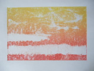
Midweek was prairie inspired monotypes and lots of sketching.
There were a lot more monotypes than this. You're getting just the highlights here, because there are too many to post. #printoctober is coming to an end, but I don't really feel done with it. I still have a multi-plate/multi-color collagraph prairie piece I'd like to do, and I need to sort out that color for the relief print. There will be more printmaking at least through the next 2 weeks...

I ended the week working on this project in styrofoam, which I will be able to print as an edition, when I get a few more kinks worked out and find some transparent ink. You can learn about styrofoam relief printing here. It's done with foam meat trays. Yes, really.
 |
| 2 colors yellow-grey |
 |
| 3 colors: yellow-red-grey |
 |
| 3 colors: yellow-grey-red |
Midweek was prairie inspired monotypes and lots of sketching.
 |
| monotype |
 |
| ghost monotype |
 |
| subtractive monotype |

 |
| monotype with watercolor pencil |
There were a lot more monotypes than this. You're getting just the highlights here, because there are too many to post. #printoctober is coming to an end, but I don't really feel done with it. I still have a multi-plate/multi-color collagraph prairie piece I'd like to do, and I need to sort out that color for the relief print. There will be more printmaking at least through the next 2 weeks...
Friday, October 25, 2013
#printoctober: monotypes, part 2
Earlier this month I shared a post about monotypes, which I was working on for #printoctober. That involved painting onto a (glass) plate with gouache or acrylic paint, and then printing the image onto a piece of printmaking paper. This is additive printing, because you are adding
material onto the plate.
You do not need to cover the entire plate. You can also just paint/ink sections of the plate and print that. This is watercolor pencil drawn onto the plate and then printed with damp paper. It didn't work as well as I'd hoped it would, on a prairie piece, but the text came out okay. It has a slightly ethereal quality about it.
Monotypes only yield one print. There isn't a second print identical to the first, and there isn't an edition. It's a one of a kind print. Last week I printed a different kind of monotype. This involved inking a (glass) plate, covering it with paper, and then drawing on the paper.
Here's what you need:
a plate, I used a glass I pulled out of a picture frame
ink
a brayer (aka a roller)
paper
pen or pencil
Roll out your ink and cover your plate completely.
Lay your paper over the plate, and draw on the paper. Try not to put any pressure on the paper, other than the tip of your pen. Rubbing will leave a mark. This is good for shading, but not good if you don't want it there, so be careful.
When you are done drawing, lift off the paper. You really only get one shot at this, but it is not difficult to lift. But once it's up, you can't put it back down, so be sure you are finished.
Here are a few more I've done over the last week.


You can also do subtractive printing. This means you start with a full plate and remove bits of ink, and then print.
Remove ink. I used toothpicks and q-tips. I was also printing with water soluble ink, so I took a wet brush and painted into the ink and later wiped some with paper towels.
Here's what I learned:
If you are drawing through the paper to transfer the image: thinner, smoother paper works better. The printmaking paper was too heavy to transfer cleanly. I tried the printmaking paper both dry and damp and saw no difference. I switched to a much lighter weight bristol, and that worked well.
Another artist recommended making a cardboard window that could go around the plate, to keep your hand from resting on the plate. This is a really good idea, but I haven't made one yet.
If you are using subtractive printing, clean off whatever you're using regularly. The toothpicks, etc, pick up small globs of ink.
None of the less than stellar pieces are being trashed. They will be used as a basis for something else down the road. I also printed a small amount of the red-yellow blend, as rolled, with no markings, to be able to print over later.
This could really be several posts but I'm running out of October for #printoctober, and I still want to get to collagraphs and multi-plate printing. Hoping to get that done and organized in the next couple of days. Otherwise #printoctober will be turning into #printnovember...
material onto the plate.
 |
| monotype, printed with acrylic paint |
You do not need to cover the entire plate. You can also just paint/ink sections of the plate and print that. This is watercolor pencil drawn onto the plate and then printed with damp paper. It didn't work as well as I'd hoped it would, on a prairie piece, but the text came out okay. It has a slightly ethereal quality about it.
 |
| watercolor pencil monotype |
 |
| watercolor pencil prairie monotype |
Monotypes only yield one print. There isn't a second print identical to the first, and there isn't an edition. It's a one of a kind print. Last week I printed a different kind of monotype. This involved inking a (glass) plate, covering it with paper, and then drawing on the paper.
Here's what you need:
a plate, I used a glass I pulled out of a picture frame
ink
a brayer (aka a roller)
paper
pen or pencil
Roll out your ink and cover your plate completely.
 |
| not exciting, but seemed important to show |
 |
| don't forget it's got to be backwards! |
When you are done drawing, lift off the paper. You really only get one shot at this, but it is not difficult to lift. But once it's up, you can't put it back down, so be sure you are finished.
 |
| bad print, on printmaking paper |
Here are a few more I've done over the last week.


You can also do subtractive printing. This means you start with a full plate and remove bits of ink, and then print.
 |
| what can I say, I love the blends |
 |
| initial removal of ink with toothpicks and q-tips |
 |
| final print |
Here's what I learned:
If you are drawing through the paper to transfer the image: thinner, smoother paper works better. The printmaking paper was too heavy to transfer cleanly. I tried the printmaking paper both dry and damp and saw no difference. I switched to a much lighter weight bristol, and that worked well.
Another artist recommended making a cardboard window that could go around the plate, to keep your hand from resting on the plate. This is a really good idea, but I haven't made one yet.
If you are using subtractive printing, clean off whatever you're using regularly. The toothpicks, etc, pick up small globs of ink.
None of the less than stellar pieces are being trashed. They will be used as a basis for something else down the road. I also printed a small amount of the red-yellow blend, as rolled, with no markings, to be able to print over later.
This could really be several posts but I'm running out of October for #printoctober, and I still want to get to collagraphs and multi-plate printing. Hoping to get that done and organized in the next couple of days. Otherwise #printoctober will be turning into #printnovember...
Sunday, October 20, 2013
in the studio
I don't have a whole to show for this week in the studio, because I spent most of this week in the kitchen. As crazy canner lady. But there's been apple pie and cakes and applesauce and apple butter and apple juice (are you sensing a theme?) and persimmon juice which will make either a fantastic or terrible jelly.

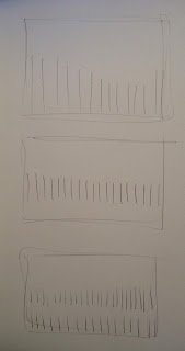
I spent a lot of this week just sketching out some ideas, most of which haven't actually been put into place.
Earlier this week, I did some relief printing from styrofoam meat trays. There is a blog post with in progress pics and details on how to do this here.

I finished out the week working again in monotypes, but a different version of what I had done previously. This involved rolling the plate, covering it with paper and then drawing on the paper. I'll have a blog post on how to do this next week.
I didn't quite have the paper centered, which was not a huge concern for me at the time. I'd just done a whole bunch of them very unsuccessfully and was trying a new paper to see if that would bring an improvement.

Both of these prints are part of the same idea. And while I thought, after the foam print, that maybe linocut should be used for them, there is something good happening in the monotype. The downside, of course is that monotype can't be printed in editions.
More work on theses ideas next week.
And more canning.

I spent a lot of this week just sketching out some ideas, most of which haven't actually been put into place.

Earlier this week, I did some relief printing from styrofoam meat trays. There is a blog post with in progress pics and details on how to do this here.

I finished out the week working again in monotypes, but a different version of what I had done previously. This involved rolling the plate, covering it with paper and then drawing on the paper. I'll have a blog post on how to do this next week.
I didn't quite have the paper centered, which was not a huge concern for me at the time. I'd just done a whole bunch of them very unsuccessfully and was trying a new paper to see if that would bring an improvement.

Both of these prints are part of the same idea. And while I thought, after the foam print, that maybe linocut should be used for them, there is something good happening in the monotype. The downside, of course is that monotype can't be printed in editions.
More work on theses ideas next week.
And more canning.
Tuesday, October 15, 2013
#printoctober: styrofoam relief prints
Last week I did some monoprints from a styrofoam plate. Or rather a plate made from a styrofoam meat tray. (But a plate from a plate would work, too... ) I didn't take pictures of the process, even though I thought about it. And, of course, I was asked for pictures I didn't take of steps I did. So I'm doing another one and this time documenting it, hopefully enough that you can see how to do it.
Here's what you need:
Styrofoam, of some flattish sort, like a meat/veggie tray. Not peanuts.
x-acto or mat knife
a pen or pencil
brayer (aka a roller)
ink (or some paint)
Cut the bottoms of the trays out. In a perfect (lazier) world, this would not be necessary. But the bottoms of the trays are stamped on the underside with branding and recycling logos, etc. I found it easier to cut when the tray was upside down. Use a sharp blade. I didn't do this. Don't follow my bad examples.
Now you are ready for your artwork. I drew out my idea and then just reworked it on the styrofoam, drawing lightly at first, so as not to make any indentations in the foam. My original plan was to have the text as positive space. This didn't really work. There was too much negative space to try to compress. Styrofoam lends itself to line drawing very well, but not much else (unless you are doing big blocks of color, or cutting the styrofoam up to add to a collagraph. It works great for that. And I just gave myself an idea for a collagraph. Look for a blog post about that next week.)

Remember your image will be backwards. The red pen on my drawing was there so I could see it through the back of the paper. Working on black is not ideal. If you can't imagine the mirror image of your artwork, then hold it up to a window and trace the backside. Then rub the front side of your artwork with charcoal or graphite or chalk/pastel. Place your drawing right side down on top of your styrofoam and trace the drawing. This will transfer your image onto the plate. This is old school. (You could also scan it and reverse it in photoshop and then print out a copy of it reversed and then transfer that... but seriously, that's more effort.) If you press hard it will indent it as well. Once you have an indentation on the foam, you can print it.
Now you are ready for ink. Roll some ink out, til the coverage on your brayer is even, then roll the plate. I didn't take pictures of this but you can see it in the linocut post. I was all fancy in that one, but this is rolled with just one color. I rolled it in light yellow first, so that you could actually see it. Black ink on a black plate is tough.

Things I would differently:
(also known as, what did I learn here? I try to remind myself that learning what doesn't work is just as important as learning what does work.)
Use a fresh blade. I was too lazy to get a new one.
I did cut against a straight edge, but it's not straight on one side, where I cut against the second plate to make them the same. Don't do this again. Also, get a t-sqaure out, because a straight edge isn't enough. It's not terrible that it's not square. Decide how important it is to you for your own design. It may be better in some cases to not be square. you might decide you don't even need to cut the styrofoam, that you can just tear off pieces of the edge until you get to a flat place. It could be cool. It will be hard to register multiple colors, but maybe that doesn't matter. You decide.
I need a little more space between letters, especially the av in have.
I did try using linoleum cutters last week and they tore the styrofoam. It would be worth trying to cut a small v with an x-acto instead of using a pen to carve. If any of you try this, let me know if it works better.
Here's what you need:
Styrofoam, of some flattish sort, like a meat/veggie tray. Not peanuts.
x-acto or mat knife
a pen or pencil
brayer (aka a roller)
ink (or some paint)
 |
| the tools of the trade |
Cut the bottoms of the trays out. In a perfect (lazier) world, this would not be necessary. But the bottoms of the trays are stamped on the underside with branding and recycling logos, etc. I found it easier to cut when the tray was upside down. Use a sharp blade. I didn't do this. Don't follow my bad examples.
 |
| the bottom of the trays. note the stamping. |
 |
| et voila! |
Now you are ready for your artwork. I drew out my idea and then just reworked it on the styrofoam, drawing lightly at first, so as not to make any indentations in the foam. My original plan was to have the text as positive space. This didn't really work. There was too much negative space to try to compress. Styrofoam lends itself to line drawing very well, but not much else (unless you are doing big blocks of color, or cutting the styrofoam up to add to a collagraph. It works great for that. And I just gave myself an idea for a collagraph. Look for a blog post about that next week.)

 |
| completed plate |
 |
| inked, so you can see it |

(also known as, what did I learn here? I try to remind myself that learning what doesn't work is just as important as learning what does work.)
Use a fresh blade. I was too lazy to get a new one.
I did cut against a straight edge, but it's not straight on one side, where I cut against the second plate to make them the same. Don't do this again. Also, get a t-sqaure out, because a straight edge isn't enough. It's not terrible that it's not square. Decide how important it is to you for your own design. It may be better in some cases to not be square. you might decide you don't even need to cut the styrofoam, that you can just tear off pieces of the edge until you get to a flat place. It could be cool. It will be hard to register multiple colors, but maybe that doesn't matter. You decide.
I need a little more space between letters, especially the av in have.
I did try using linoleum cutters last week and they tore the styrofoam. It would be worth trying to cut a small v with an x-acto instead of using a pen to carve. If any of you try this, let me know if it works better.
Subscribe to:
Posts (Atom)