
I ended the week working on this project in styrofoam, which I will be able to print as an edition, when I get a few more kinks worked out and find some transparent ink. You can learn about styrofoam relief printing here. It's done with foam meat trays. Yes, really.
 |
| 2 colors yellow-grey |
 |
| 3 colors: yellow-red-grey |
 |
| 3 colors: yellow-grey-red |
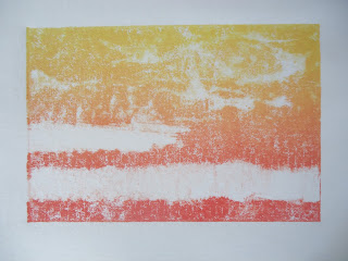
Midweek was prairie inspired monotypes and lots of sketching.
 |
| monotype |
 |
| ghost monotype |
 |
| subtractive monotype |
 |
| monotype with watercolor pencil |
There were a lot more monotypes than this. You're getting just the highlights here, because there are too many to post. #printoctober is coming to an end, but I don't really feel done with it. I still have a multi-plate/multi-color collagraph prairie piece I'd like to do, and I need to sort out that color for the relief print. There will be more printmaking at least through the next 2 weeks...
No comments:
Post a Comment